Three Minute Film Ideas
Idea One- Nocturnal rats
It is late at night and a woman is trying to go bed but she has pet rats in her bedroom that seem to become active once their owner decides to try to go to sleep. As soon as the owner switches her lights off the rats get to work in their cage making as much noise as possible with medieval banquets to circus festivals, raves, using road work equipment and wrestle-mania competitions every time the owner switches her light on and off.
I came up with this idea because I own three male rats and they seem to make it their job to keep me awake every night, no matter how much I get them out of their cage and try to keep them awake during the day.
I decided to look into colour schemes and styles in which I would like to animate my short film. I would obviously also add my own little twist to the designs. I looked at a few drawings done by other artists on the internet.
http://www.ratforum.com/showthread.php?52740-Tumblr-layout-art.
I loved the colours in this image and how the rats were made to have almost human characteristics. The design is also very cute and light.
http://anyadserval.deviantart.com/art/Fat-Rat-55931624
I really like the design of this drawing as it is quite detailed but I think animating in this style would be quite hard. It also looks a bit more like a kangaroo face than a rat face.
https://ratgirlstudios.wordpress.com/tag/drawings/
This sketch is so simple but the detail and lines are drawn so well that they portray a sense of emotion from the rat.
http://www.deviantart.com/art/Yuki-Sohma-RAT-85306798
This style is very cute, it so simple but hit me straight away with how adorable it is.
http://karrakas.deviantart.com/art/running-rat-animated-190286516
I came across this walk cycle and the movement and motion have been drawn so well, I really like the style and bold outline. It is so smooth.
http://xratlovex.deviantart.com/art/My-rat-animation-286542415
This walk cycle is a bit faster and more cartoony but I really like the pencil sketchy feel to it.
I looked into animated films that involved rat characters. Some films portray rats as evil ugly creatures but a lot include rats as being young, creative and fairly smart. I watched films such as Ratatouille, An American Tale, The Great Mouse Detective, and The Tale of Desperaux to compare different styles of animation and character concepts. I think I prefer the more traditional style like in An american tale than Ratatouille.
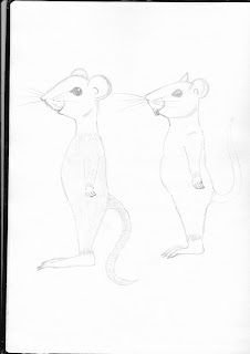
I have used my own pet rats as reference and drawn them during their play time which was quite difficult as they were running around a lot. From these sketches I have come up with some basic character designs for my rats. This will need to be improved over time.
I decided to use my rats as a reference and do some sketches of them before starting a few character sketches.
Idea two
Everybody has a shadow that they believe is formed from rays of light shining between their body and a surface when in fact it is the devils way of keeping an eye on people committing sins, it is like a looking glass for him so he can plan punishments which people refer to as karma. The devil is shown causing havoc in peoples lives.
This idea came to me when I saw a video of a young girl running away from her shadow as if she was scared of it as if she believed it was not attached to her but was something else all together.
I decided to look into portals, the devil and shadows to get some sort of idea on how I should make my animation look from character design to style of the animation.
https://isthatinthebible.wordpress.com/2015/02/06/princes-of-darkness-the-devils-many-faces-in-scripture-and-tradition/
Tim Curry played the devil in the movie The Legend and played the devil very well ruining a perfect world with his minions and trying to turn everything pure into darkness. He was the ultimate evil and I think the way the character is designed is how most people portray the devil being stocky with huge horns and red skin.
http://www.nextquotidiano.it/wp-content/uploads/2015/03/Metal-GIF.gif
This particular gif is from Tenacious D and the pick of destiny where they have to battle with the devil through music. Yet again the devil is the way everyone thinks of him, big, red skinned with horns from his head.
In some films the devil is seem as being human with supreme power but little hints give them away. In Constantine the devil can be found wearing a white suit but his skin his grey and he oozes black gooey tar like substance from his feet when he walks. You also know when he has been close as swarms of bugs can be found.
In The Devil's Advocate The devil is a business man, a high end lawyer who manipulates people to give into sin.
https://blogger.googleusercontent.com/img/b/R29vZ2xl/AVvXsEj1ps2fn7tkBnXp7UQqFdx2XZD0qJKgYvaSsHzmunZe1fZv67FqM2WEwv0PNh8lM4_kPFSgKNwoAWsUvOfYeLqgUPnLpOHZAOt360IvONCSGo0F6FlM4oy51mrwcylKTDtchbX9ixfpJUk/s1600/MS_28997.jpg
This is the devil from one of my favourite movies Little Nicky. He does not look entirely like your standard devil however he does have little horns and the beard.
Shadows are seen as evil by many people or at least seen as creepy when you are younger. As the saying goes, you never know what could be lurking in the shadows.
http://zohebdesigns.blogspot.co.uk/2012_04_01_archive.html
I really like this design as it feels as though the woman does not have a choice in the fact that her corrupt shadow is attached to her. It is not just a shadow but is literally stuck to her like stringy glue.
https://www.flickr.com/photos/8058853@N06/2447435856
http://skaramanger.deviantart.com/art/Shadow-demon-281368050
I really like this design for a shadow as it seems as though if it was to be animated it would be able to easily transform as it is not a solid shadow.
My next step was to look into portals as I was thinking of using the shadows as possible portals from hell to the real world for the devil to see peoples sins kind of like a looking glass.
https://www.pinterest.com/pin/437271445042239093/
http://www.chaosnode.net/blog/2013/04/12/magical-daydreams-worldbuilding/
This portal reminds me a bit of lord of the rings and would be well suited for an animation based around sins and the devil.
https://www.pinterest.com/pin/409264684862832834/
I think a silhouette or black and grey animation style would be well suited to this idea. Base the whole idea around shadows and add quite a bit of stretch and squash in the animation.
I tried to put down a few ideas of how the devil might look and how his portals might look.
Idea three
A woman is given a dream catcher as a present by her friend as a gift. She does not believe that dream catchers actually work but hangs it up before bed anyway. As she goes to bed the magic in the dream catcher starts to work. A guardian in the form of light appears and sits on the edge of the dream catcher. It starts to play the dream catcher like a harp softly as the woman sleeps. As the woman starts to have a nightmare the black dream flows up to the dream catcher and the guardian fights them off with musical notes like a bow and arrow whilst playing her music or uses one of the feathers as a sword. Once the nightmare has been defeated the guardian returns to the bead of the dream catcher as the sun rises and before the woman wakes up.
This idea actually stemmed from me collecting dream catchers and my friend buying me one when he got back from holiday. I was having a debate on peoples beliefs and stories behind dream catchers, if they worked and why. from my personal opinion people tend to buy them because they want to believe that they work and their dreams and minds can be protected when their bodies can not function enough to protect them, they are left vulnerable when asleep.
I decided to read up on The History of Dream catchers. After reading about them I thought I would put my own twist on the story by adding a guardian. My guardian is going to be made of light. I am unsure on whether I want her to have a face yet. I will be using the dream catcher that my friend got me as a reference to my drawings when animating.
As part of my idea the guardian uses a bow and arrow. I am unsure on how to do this yet, if I should use the dream catcher itself as a bow and musical notes as arrows so I decided to see if there were any I liked the look of.
http://orig02.deviantart.net/1bca/f/2008/357/6/e/ruby_bow_fire_opal_arrow_by_sunrise_oasis.png
I like the colours and design of this bow and arrow as it is very light and gleams which is how I want my guardian to be.
http://www.online-instagram.com/media/981301764190641574_5985774
http://www.urbanthreads.com/products.aspx?productid=ut4915
This design feels as though it could fit in with the dream catcher very well as it has the feathers and the bow is like twisted rope like the outside of the dream catcher.
I then tried to see if I could find some inspiration for my light guardian.
http://orig04.deviantart.net/bb28/f/2008/346/8/5/kh__guardian_of_light_by_phoenixtrooper.jpg
http://img03.deviantart.net/978c/i/2013/013/8/c/sandman__centre_of_dreams_by_kimmie2598-d5rci6p.jpg
Sandy the guardian of dreams from Rise of the Guardians is a good example of what I might possibly go for but my designs will be female.
http://hdwp.me/abstract/blue-glowing-woman-silhouette-40983/
This is more the style that I had in mind. A glowing woman but she would be white or yellow. Not sure on if I should add a face or leave her as just a glowing figure.
http://www.danzigergallery.com/exhibition/christopher-bucklow_2
I need a way of showing nightmares and how the guardian is going to fight them so need to figure out how I want them too look.
http://paulbielaczyc.com/art-galleries-2/black-white-gallery/nightmare/
This articular image reminds me of Harry Potter and the dememtors. In this case it could be sucking up the good dreams and replacing them with the bad.
https://www.pinterest.com/pin/489696159453412613/
Here are a few sketches of what the guardian might look like.
Chosen Idea, Ratty Rampage
After thinking over my three ideas I decided to choose my first Idea. This is because it is something close to me that I have to deal with every day. It is based on fact but with a bit of a funny twist. All of the research I need for my characters is with me and in front of me and I also know a fair bit about rats already due to owning them for years. I love traditional 2D style animation so the pencil hand drawn style is what I am going to go for when I design my characters. I came up with a few different styles but some looked too human which would not make for adorable characters you could relate to or bond with as easily.
So I decided to sketch again and try to create something a little bit cuter that also looked like my own rats.
These sketches are a lot simpler and cute. The rats having big adorable eyes and being fairly round. These sketches made way for my later sketches.
The script
I Needed a story now to storyboard. I went through a few drafts and kept changing the script as it did not make sense at first or I found some things that would suit it better. Also figuring out what to do lighting wise throughout the story, whether to use lights inside or the moon or a lamp. This is my old script break down before I redid my script.
Character designs
For my characters I used my own rats as reference and made little uniforms for them to suit the scenarios that they were in throughout the story.
The rats having cuddles feeling sleepy
The rats having cuddles feeling sleepy
Bath time
https://www.youtube.com/watch?v=DtamSVxCwSk
The rats play fighting.
https://www.youtube.com/watch?v=yEmL2tvQ3Ys
Desmo
Orion
Eli
Line up of all three of the rats.
I tried to stick to the colours and heights of the rats as much as possible as what they look like in reality and to make them look unique against one another so that they are easy to tell apart from one another.
I also had to design the woman that was caring for the rats so decided to sketch a few different styles for her too. I sketched different facial features.
The first sketch I came up with I was actually quite happy with the simplicity but it still didn't quite look the way I wanted it too.
I liked the face shape on this sketch but felt it might have looked a bit too masculine.
This was my chosen design for the character as it was simple but still had enough shape for what I wanted.
I honestly have no idea what was going on with this one, the eyes were way too big for what I was looking for and hair is too short but was just a thought provoking sketch.
Backgrounds and storyboards
The background designs were based on the bedroom I was in at the time when I thought of the ratty rampage idea. I did later on redo my storyboard and changed a lot of details based on timing, angles, lighting, what I wanted in the shots and in what order as well as he general overall design. I wanted to keep the backgrounds rather plain and clean with the colour scheme of cream and blue to keep it fairly light and neutral.
The boxing scene ended up being changed into a little bit of star wars fight scene.
The very quick animatic can be seen using the link below. I did not even do a proper animatic really just did the storyboard then added some sounds into it and a bit of music.
I was also able to make a rough dvd cover for the animatic and a synopsis. I thought it looked cute at first but looking back on it now I think it looks rather plain.
New backgrounds
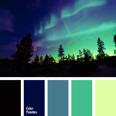
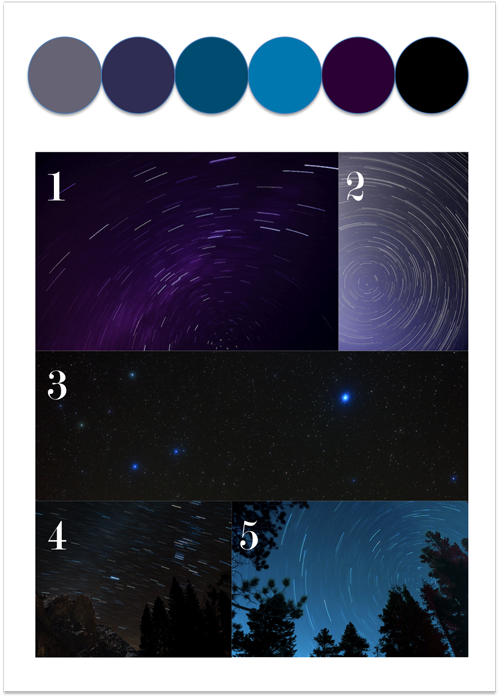
After completing the animatic I felt as though I wanted to change my backgrounds so I just changed them a bit to what I had in my head. I still kept the same colours and colour schemes but I needed to focus more on the light source. Where it was coming from and what angle to hit the rats to light up the shots. I had two light sources. I decided to use the moon for the rats and a lamp for the woman in the scenes where she turns it on and off whilst shouting at the rats. I also looked into colour schemes for night scenes compared to day time scenes.

http://colorpalettes.net/tag/night-color/

https://www.pinterest.co.uk/pin/657173770597976757/?lp=true

https://louisegale.com/2011/08/color-story-7-starry-starry-night/
Pinterest was really helpful when it came to colour pallets for my night time scenes. I really liked the purple settings but then decided to go with blue as blue is the overall colour for most night scenes especially when it comes to using the glow of the moon to light up my shots for the night shots throughout the film. The new backgrounds are a bit more detailed and cleaner. Originally I was going to certain backgrounds very detailed like an actual tent circus background and city construction site but after a few discussions with people it became obvious that it would not make sense and would be too much so instead having a few objects like suits for the rats to wear and toys with some imagination from the rats would work out a lot better. All of my backgrounds were created in photoshop.
For my night backgrounds I decided to experiment with the amount of glow from the moon so I saved a few different variations.
The Construction site backgrounds, I tried to keep the backgrounds simple with a few objects such as stop signs, a car and bricks with a area for cement.
The background below has more of a glow from the moon onto the cage which I personally prefer from the one above and is used well as the main light source for the rats.
Circus themed backgrounds
Changes through the animation process
During the second semester I managed to update my storyboard and reorganise certain shots so that to me the story made better sense. I got a voice actress to do voice recording for me instead of having to use my own voice recordings like in my animatic but she made mistakes in the first round of sound recordings, so then I had to wait a few weeks until I could get a second lot of recordings. When I was able to get them and break them down I used a mixture of recordings from the first set and the second set.
I was going to animate in photoshop and wanted to make the animation look fairly traditional but due to working full time nights I was running out of time so had to change the way I was going to animate. Instead of photoshop I was going to use after effects so redraw my characters ready to be rigged. Whilst drawing my characters again they were redesigned. These changes were made as I was drawing them and it was just something I felt looked good at that moment in time.
A few images from Desmo's new designs. I tried to imitate fairly realistic fur into the designs. There was about 100 layers per character to use during animation.
Desmos new clown costume and makeup.
Builders hat
Desmo without any of his costumes
Star wars belt and using his tail as a light sabre
Eli
Eli with his builders vest and hat
Star wars costume kylo rat
Little gymnastic costume for on the hoops
Orion does not have as many costumes
Gymnastic costume for the hoops in the circus
Wearing a suit when in the car. I decoded to go for a relaxed traditional white shirt and tie
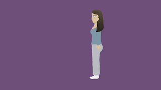
The female in my animation based off myself in her pjs.
When I started trying to animate in after effects the software kept on freezing and would not respond so I decided to try and learn a new software. The software I decided to learn was adobe character animate. It is still a very new software but rigging the characters seemed easier than in after effects due to the way the software is set up. I watched a few tutorials on how to use the software.
Starting with how the software works.
How to make your first character as you have to set the layers up in photoshop in a certain way for the rig to work in character animate.
How to give your character walk behaviours to get them to do a walk cycle.
Another video that was extremely useful was how to create pans and zooms in character animate.
When I started to animate I first animated all the shots with the woman in them. I tested a few walk cycles and it took me some getting used to and I got quite a few things wrong like the head kept floating and would not attach to the body then the body kept warping when I got the head right.
I managed to get a walk cycle roughly the way I would like it to be.
The same thing happened with the heads when I tried to rig the rats as well but with the rats there was some major warping. Unfortunately I forgot to record it for my blog. I managed to sort it out by going through every layer in my rig and rearrange a few of them get the rig to work properly. Also by applying bones to my rig and move a few fixed points. Took me a while to figure out the problems as I was very tired at 4am in the morning.
Managed to record the head not being attached. The software uses webcam so if you blink the character blinks and lip syncing syncs with the mic too.
The good thing about character animate is that I was able to save all my shots and scenes in one project so that when I needed to go back to it then it was there. The bad thing is you only have one rigging window so if you needed a character for the character to be shown in the scene you would have to set that character up in the rigging window every time or you could not see what you had already recorded in the scene window unless you had already exported the footage. This became a nuisance when I was running out of time. When animating I did not even end up using all of the layers or images I drew for the film as I had to keep it very basic due to the time I had left if I was going to create a finished film. I was not able to do the sort of animation I wanted due to personal circumstances leaving me with very little time so my rats walks were more like characters from South Park. There was very little animation actually involved in the short film.
https://www.youtube.com/watch?v=lSMTVZ58fvc
As I was editing my film and putting sound effects and dialogue in I noticed all of my sound effects were missing so I had to gather some new sound effects. I discovered a site called freesound.org which was very helpful. Its a community of people who create sounds and share them and you can add your own sound effects to share with the community.
https://www.freesound.org/browse/tags/sound-effects/
I managed to get all of the sounds I wanted with a bit of music into the film but I wished I was able to stick to the original way I wanted to animate, traditional style in photoshop with some fluid movement to better tell the story. I put everything together in Premiere pro. Here is the finished film in the link below.


No comments:
Post a Comment